Swiss House Design


Swiss House Design Architects: Nimmrichter cda Location: Dietlikon, Switzerland Project Team: Rolf Carl Nimmrichter, Dennis Clayton Matthiesen Site management: Knecht Baumangement, Schlieren Timber construction: Hector Egger, Langenthal Interior: Teo Jakob Colombo, Zurich Project Year: 2007-2008
The geometric house – Swiss House S is designed by Nimmrichter cda. The design were determined by the desire for autonomy of form and materiality with good interaction between house and swimming pool already on the land. Built in three-floor equipped with garage and necessary storage and utility rooms which located in the basement. The open-plan ground floor comprises one large living, eating and cooking area, and there are three bedrooms and a recessed balcony on the upper floor.
🎆

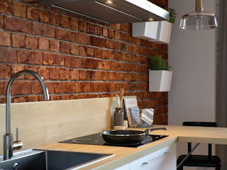
comfortable bathrooms make you feel more at home linger longer soak away, the kitchen and the sink with a wall of red makes the room bright with sufficient light, behind the house or next to the house there is a terrace for you to relax while looking cool environment so that the hearts and minds feel more frees.

Quiet Refuge


Quiet Refuge Barbara 
Hawthorn breathes new life into a mid-century rambler in Great Falls


A light snow covered a wooded Great Falls, Virginia, property in a lacy veil as a couple pulled into the driveway. On a whim, they’d followed “open house” signs here after going for brunch nearby. Having relocated from Chicago the previous year, they’d spent 18 months living in a DC apartment while looking for the perfect home. 
 Their hopes plummeted when they glimpsed the dark and dated 1950s rambler for sale. But the real estate agent on site convinced them it was worth a look inside, where they were greeted by a stunning view of the four-acre lot through a wall of windows in the open living/dining room. Looking past the saffron-colored walls, oddly placed chair rails and swag, they agreed the house had potential. “We literally walked into a 1950s time capsule,” the husband recalls. “But it was solidly built and hadn’t been altered in any way.”

 Taken by the house’s clean lines, simple layout and generous glass exposures, the couple bought the property in 2014 and hired interior designer Barbara Hawthorn to bring it into the 21st century. She embarked on a comprehensive, five-month makeover that would strip the interiors down to the studs, replace the original floors and windows, upgrade the electrical and lighting systems and overhaul the outdated kitchen and baths. Hawthorn also redefined the interior architecture, removing moldings and wainscoting and concealing brick walls. “When I start a project, I can see ‘beyond.’ I look at the bones, I look at the structure, I look at the flow of a space and I get rid of all of the static,” she says. The couple envisioned their new home as a soothing escape where they could recharge and unwind. “Their lifestyles are so busy, they realized they wanted a more bucolic setting, a retreat where they can really relax,” the designer explains. 
 To create this environment, she focused on a soft, neutral color palette; richly textured fabrics and floor coverings; and organic materials that would blend in with the natural surroundings. In the living room, a wall of tiles by Porcelanosa, billowing Stroheim drapes and fabric depicting gingko leaves on new lounge chairs convey minimal, understated elegance. Serene blues impart a sense of calm in the master bedroom, from the grasscloth wallcovering to the damask bedding and luxurious drapes. 

 One of Hawthorn’s greatest hurdles was finding a way to meld the aesthetic her clients wanted with the pieces they each brought from their disparate collections. Married just three years ago, the homeowners both travel extensively. The husband, who spent decades in the diplomatic corps, has amassed a vast collection of Asian art and antiques. 

The wife, who grew up in Europe, has inherited a number of family heirlooms and antiques. “Making the antiques come together and live compatibly was a challenge,” Hawthorn relates. Throughout the home, the designer expertly bridged the gap between styles. The squared-off, geometrical chairs in the living room stand up well to antique Korean chests flanking the fireplace. 

A pair of chairs and an antique desk from the wife’s collection introduce feminine lines in the bedroom, offsetting a modern armoire of Hawthorn’s design. “As far as my pieces go,” says the wife, “they were really important to me. They soften the Asian influences.” Where possible, Hawthorn repurposed her clients’ furnishings and art, including a Japanese screen that she mounted on the living room wall and customized to conceal a TV. 
“To me,” says the designer, “what people have in their collections is what makes a house feel like home.” On the lower level, she created an office for the husband with custom bookshelves to accommodate his impressive library. He also has room to display many of the mementoes he’s collected abroad. 
Three guest bedrooms, a new guest bathroom and a powder room welcome visitors in style. When the couple travels these days, they can’t wait to return to their new “getaway” in Great Falls. “We just want to come home and ‘be,’” says the wife. “This is our haven, our retirement home and our vacation home—all in one.”

Apartements Minimalist Style Japanese


Two Apartments In Minimalist Modern 

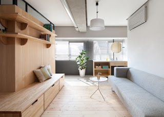
Japoneses Style (with solid wood floor) Even as we have explored before, the Japoneses style decor aesthetic will be highly tied to the concept of minimalism and negative living space. In these small condominiums, you will see that there is really nothing there it does not have an intention. The spaces never feel cluttered as well as cramped, it doesn't matter what the genuine area measurements. Instead, air and energy can simply flow from room to help room within a relaxing and comforting way. Natural solid wood is a different common take into account Japanese pattern, and even though spaces apply it to wonderful effect. Coupled with swaths involving sunlight and warm, mild colors, even a tiny space may feel open as well as orderly when making use of this fashion.


The first apartment is a renovation, done by the team at Sinato Architects. The house is known as Fujigaoka M and is more than two decades old. The purpose of the renovation was to create a space that was both more modern and more comfortable for the married couple who was to live there.


The architects sought to make the house more open and give it the connected feeling that comes with living as a couple.


None of the rooms in the home are closed off by walls and doors. Instead, half walls create some division and necessary privacy while sunlight from two sides of the home is allowed to flood in.

 
Cozy Bedroom
Visit: Bedroom Modern Japanese

Of course, the use of sturdy natural wood, for the inner terrace as well as furnishings and flooring, is distinctly aligned with the Japanese aesthetic, giving the entire space a warm and cozy glow.

 
wood panel ideas

The central portion of the house, referred to as the “inner terrace” by the renovators, acts as a room separation but does not close anything off. Instead, it offers space for storage as well as display walls for personal photos, art, and books. The central wall therefore becomes a personal element of the house that is easily updated for seasonal changes or the occasional redecoration.


The second apartment is also a renovation, this time of a 75 square meter (800 square foot) home in Western Australia. The renovation was undertaken by Clare Cousins Architects and was necessary to make a warm and open home for a young family who was expecting their first child.

This was partially accomplished through the use of sleeping cubbies, that are no larger than a mattress. These areas can be closed off at night for privacy, or during the day to hide the bedroom away.

A young family of course will also want to be able to entertain on occasion and perhaps have overnight guests. The lofted area of the apartment accomplishes that goal with a spare guest bed as well as access area to hidden storage compartments. The lofted storage is actually home to more furniture, made from plywood, that folds flat to save space.

 
modern shelving design


Moveable partitions throughout the home give residents the option to change the layout as they see fit, from day to day.


A simple but chic bathroom uses clean white tiles and gold plated fixtures for a modern and minimal – if not traditionally Japanese – look.
Minimalist Japanese Style
Visit : Minimalist Apartement
Fan of the Japanese style? Do check out these then.
Visit: Bedroom & Interior Japanese

The interior design of the apartments


The interior design of the apartments Designed for a young man in Moscow, this studio apartment uses a mostly-grayscale color scheme brought to life by shots of brilliant yellow – and it doesn’t shy away from using bold textures and prints wherever possible.


A ring-shaped pendant light and triangular side table adds a touch of geometric variation to a room based largely on rectangles and lines. The white edges on the glass bedroom panels look amazing when the divider is fanned open.


The dining room continues the yellow theme. Isamu Noguchi’s Cyclone dining table offers a touch of industrial appeal, surrounded by the distinctive Ginger Ale Armchair from Roberto Lazzeroni upholstered with coordinated perfection.


The bedroom faces the sitting room, separated by a glass wall with a sliding privacy curtain. The color scheme in this room is more sensual: royal blue, violet, and coffee.


A compact kitchen unit integrates all the necessary appliances, plus plenty of room for storage. This is also a great angle to view the dramatic transition from dark marbled tile to ash gray wood flooring.


The office breaks the theme of black, white, and yellow with a splash of comforting blue, more comparable to the bedroom than any other room.


Clocking in at just under 35 square meters, this small apartment takes advantage of its unique architecture and layout in a few inspiring ways. Parquet flooring and rough brick set the scene – accented with a bright red couch and contrasting steel blue accents. The overstuffed red couch creates a kind of “signature look”, distinctive and casual.


A small office resides on an open sun room. Suspended in the center of the room between the walls, the desk enjoys plenty of space ahead and behind, easily avoiding the small room dilemma that causes many designers to simply push the workspace against a wall. The free and uncluttered atmosphere would certainly help boost concentration.


Rather than opting for a solid kitchen island, a steel-framed table doubles up as a dual-purpose dining table and work surface. This lets more light reach the compact kitchen – a smart choice for a home with sunlight coming from only one direction.